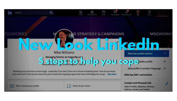
If you haven’t logged into your LinkedIn account for a while, you might be in for a surprise!
The company has dramatically changed the look and feel of the site. Most of the changes are improvements in my opinion, but there are some important differences that you will need to be aware of in order to keep your profile sharp.
Many of the changes seem designed to push you towards the various LinkedIn Premium products – but fear not, (almost) everything you knew and loved (or hated) about the free version is still there, if you look.
First of all – what are the major changes?

New LInkedIn Menu Bar
The navigation has changed and is now much more modern and intuitive. The menu bar is divided into sections, which keeps the main page clutter free. The ‘Home’ page is still your timeline, showing posts and articles from your connections and allowing you to post your own updates.
The ‘Network’ page has been streamlined, showing you only the important stuff: who has viewed your profile and who you might want to connect with. However I have noticed a couple of big changes:
You can no longer see how you rank for profile views. This isn’t a big deal, as it was a dubious metric at best (and could lead to lots of insecurity and ego bashing!). It would be nice to have some way to assess whether changes to your profile are making a difference – and maybe LinkedIn are working on a replacement. For now, you will have to use the raw number of profile views as your main benchmark.
You can no longer export your contacts as a .csv file. This was a great feature if used responsibly – it was perfect for syncing your LinkedIn account with a CRM. Or for those less ethically minded, building a cheap email list. As useful as it was, I’m surprised it didn’t go sooner to be honest. It was open to all sorts of abuse and also provided a bridge out of the LinkedIn ecosystem, which the company obviously wants to keep you locked into.
The Jobs page is much improved, giving you at a glance access to relevant vacancies (and the vacancies seem more carefully targeted too)
Messaging works as before, except that there is now an always on messaging tab open in the bottom right corner for quick access. Another good feature, copied from Facebook, that means you can keep a profile or article open while you message.
Your profile tab makes it much easier to manage your settings and also your company pages (which was a bit of a chore before). Your profile is also where you will see the biggest changes, and where you should take some immediate steps to make sure you look your best.
Here are five things you can do now to improve your new look LinkedIn profile:
Step 1) If you had a lovingly created background photo, you might need a new version to fit in the new, smaller space. Especially if you had text in the image which might now be obscured.
Step 2) There is much less room for your Summary. Only two lines will be shown and so you need to make sure you are grabbing your audience from the very first line! The chances of people clicking ‘see more..’ are slim if the first sentence is poor. There is no headline any more, so the first line of your Summary should be your headline.
Step 3) You can no longer drag and drop different profile sections – so if you wanted your Education to appear below your Featured Skills & Endorsements, tough luck. Everything is in a fixed order now: Activity, then Experience, Education, Skills, Recommendations and Accomplishments. If you have a great recommendation or two, consider copying and pasting the best bits as a testimonial in your Summary.
Step 4) Click on ‘View Your Public Profile’ and check that everything is appearing as you would like. This is how people who are not logged in to LinkedIn or not connected to you will see you. The new version of LinkedIn has made it very easy to choose exactly what will appear, with a handy list of checkboxes down the right hand side. Simply tick or untick the relevant box to show or hide information.
Step 5) Make use of LinkedIn’s power features. LinkedIn’s ‘Advanced Search’ was always one of its best features (especially for sales prospecting), allowing you to target people by all sorts of features (from location to experience). The bad news is that some of the filters (e.g. job title) have moved into LinkedIn Premium. the good news is that all of the basic filters are right there in the search box. Simply click the magnifying glass next to the search box on the home page and you will see all of the filters on the right hand side of the search page. You should be able to find all sorts of useful new contacts this way.

My LinkedIn Profile – it needs updating!
As with all changes to a beloved programme, it will take some time to adjust to the new LinkedIn and it will be interesting to see where the new owners (Microsoft) take the site in future. For content marketers LinkedIn always offered far better organic reach and engagement than other social media sites and I hope this will continue to be the case and that they don’t move towards more sponsored content or boosted posts as Facebook have done
For now it remains the most powerful business and recruitment network in the world and it is absolutely essential that you build and maintain a strong presence, if you want to promote yourself, your business or your career. Let me know what you think in the comments below.

